Dark Mode – more choice for users
Dark Mode – more choice for users
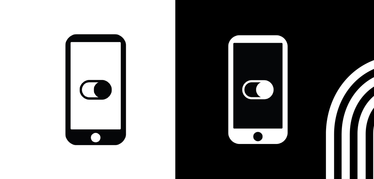
Since the introduction of Dark Mode by iOS and Android, digital content can be displayed against a dark background instead of bright white. If you choose this view, you can save and increase your battery power; it’s also easier on your eyes and improves legibility.
Initially ridiculed as a feature for nerds, Dark Mode is becoming more and more popular: 36 per cent of iPhone users are already using the Dark Mode view, and up to 13 per cent are already opening their emails and newsletters on a dark background – the trend is increasing. Messaging trendsetters, such as Apple, Gmail, Apple Mail, Outlook, etc., have been offering Dark Mode for a long time.
And because the topic is so clearly trending, companies should also take into account the individual preferences and ‘viewing choices’ of their recipients, and provide a Dark Mode version of their emails and newsletters. Indeed, this only has advantages, because the Dark Mode is...
... good for the UX: the user experience is reader-friendly if the use of Dark Mode is taken on board right from the start.
... good for CI / CD: emails and newsletters fit perfectly into a brand’s CI / CD without errors in display even in Dark Mode.
... good for image: using an optimally functioning Dark Mode view, a brand is perceived as progressive, modern and customer-centred.
Companies that are now acting promptly to optimise their email and newsletter presence can immediately offer users real added value in the digital experience and stand out from the competition.
There are still many examples of inadequately implemented Dark Modes, such as round pictures bordered with square white space, incorrectly converted colours or dark text on a black background. By contrast, prominent trailblazers such as Nike and Netflix demonstrate how to implement Dark Mode well and how the same content in the dark version immediately looks both functional and elegant.
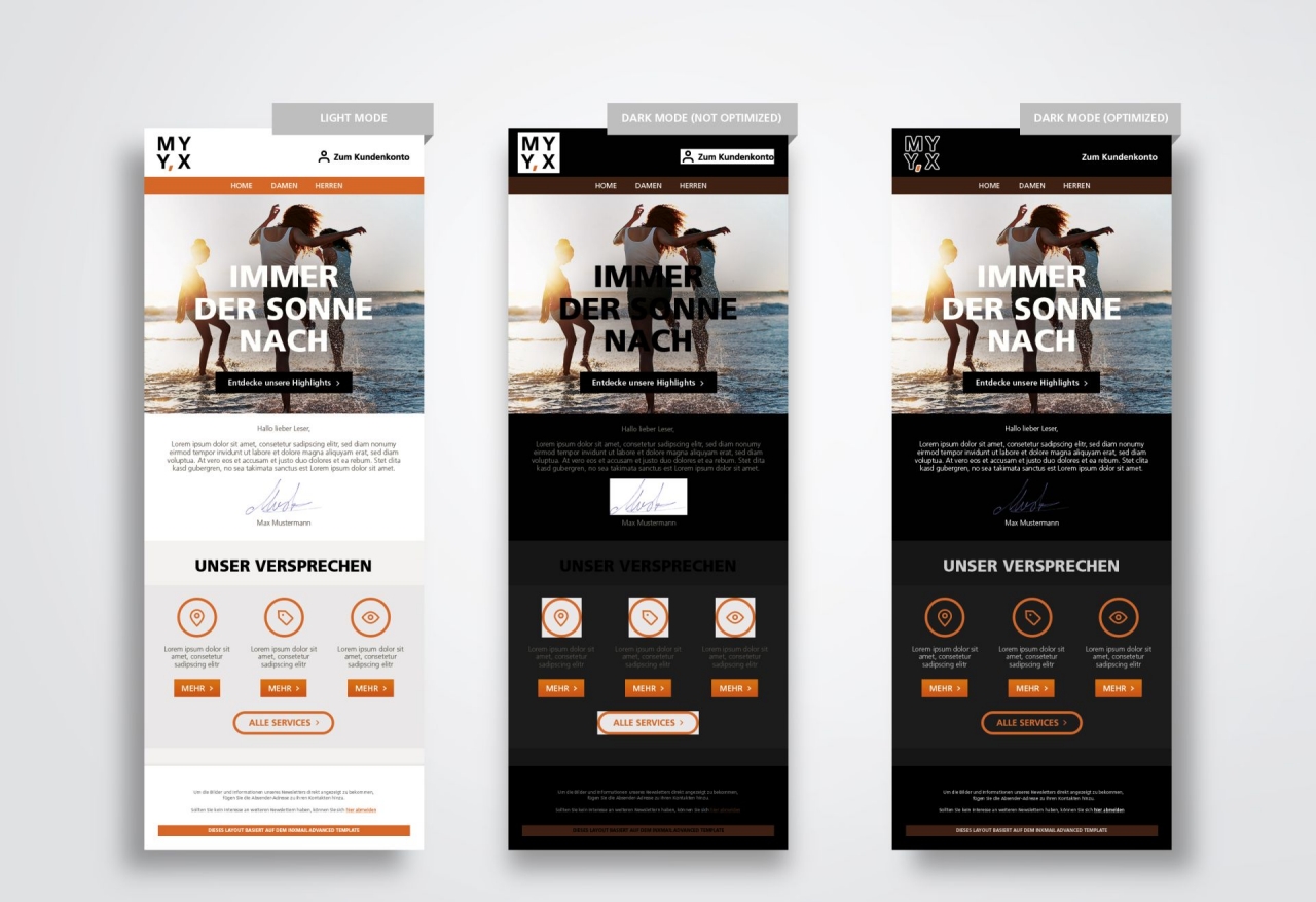
‘Converting’ your assets is not very complicated. If you decide to offer Dark Mode for emails and newsletters, you should consider these few tips and tricks:
1. Before optimisation, testing it with all your clients can clarify issues: how do the emails currently look in Dark Mode?
2. Non-square images should be saved as a PNG with a transparent background. This prevents square white space from appearing around a round or outlined image in Dark Mode.
3. Logos and graphic text should be optimised using outlines or drop-shadows. Outlines or thin, white drop-shadows can help dark fonts in particular stand out against the black background of Dark Mode.
4. Take care when overlaying text on images – the colour inversion can reduce the contrast and thus impair legibility.
5. Images and background colour should not be mixed: background colours are inverted in Dark Mode, but images are not.
6. Take care when using coloured text and background areas: in Dark Mode, the colour inversion uses either the complementary colour or a very light shade and can thus distort the corporate design.
Today, Dark Mode is still an option for a steadily growing target group. This means that optimisation is becoming more important month on month for everyone who literally wants to look good in every mode selected by the user.
Author: Georg Klemm / Head of Creation, Plan.Net Connect